E-commerce experience empowered a telecom giant to retain existing customers and surge in new leads
A responsive online application for selling telecom products to other small businesses, such as the Internet, Phone, and Business TV services.
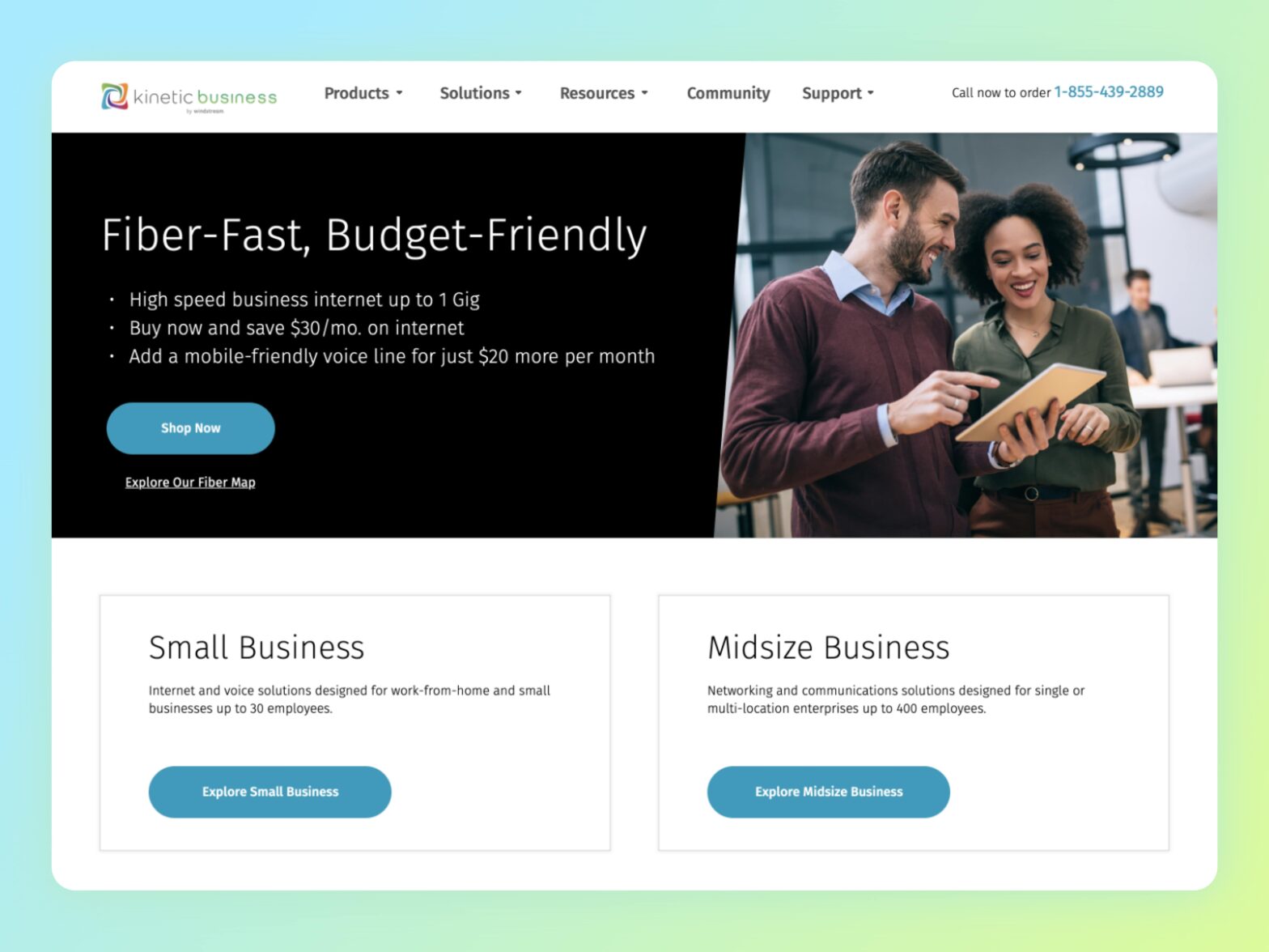
- Ecommerce
- Responsive Web Design
- UX Improvements
About Windstream
Windstream provides high-speed broadband Internet, phone service and Digital TV packages to residential customers as well as products and services for small, medium and large businesses, and government agencies.
Project background
Prior to the client coming to us for a resolution. They are not receiving a lot of traffic or sales through their web presence due to a design and experience. The client wanted to sell services online in addition to building a new website.
Problem statement
The lack of an online purchasing experience on client's platform causes immediate user abandonment, resulting in lost opportunities for engagement and revenue generation.
Business goals
- Increase service sales on online
- Help users to buy products online and reduce phone calls to the sales team.
- Increase new users registration
- Increase user engagement
Design challenge
Create an online experience to sell telecom services to business sectors, also reduce getting a lot of phone calls to support team for buying services.
Our proposal
Create a seamless experience to build and configure packages by themselves and checkout, and refine existing website experience and design according to existing design system.
Talking to the users
We got knowledge about business goals, We started by setting up an interview with potential users of services to hear about what they more care about and what they expect as a user of this service.
Key problems
- Too many clicks to reach checkout.
- It’s frustrating to call the sales team for updating the plan.
- The waiting period is very high to get calls from the sales team to confirm the order.
- It’s annoying to read too much content to know about a product.
- I don’t know how to go to next step!
- Confusing user interface.
How do we get there?
User interviews and surveys, we heard frustrations and disappointment rather than a pat on the shoulder. So we had to work on some research technics to see more opportunities.
Usability test of
the current userflow
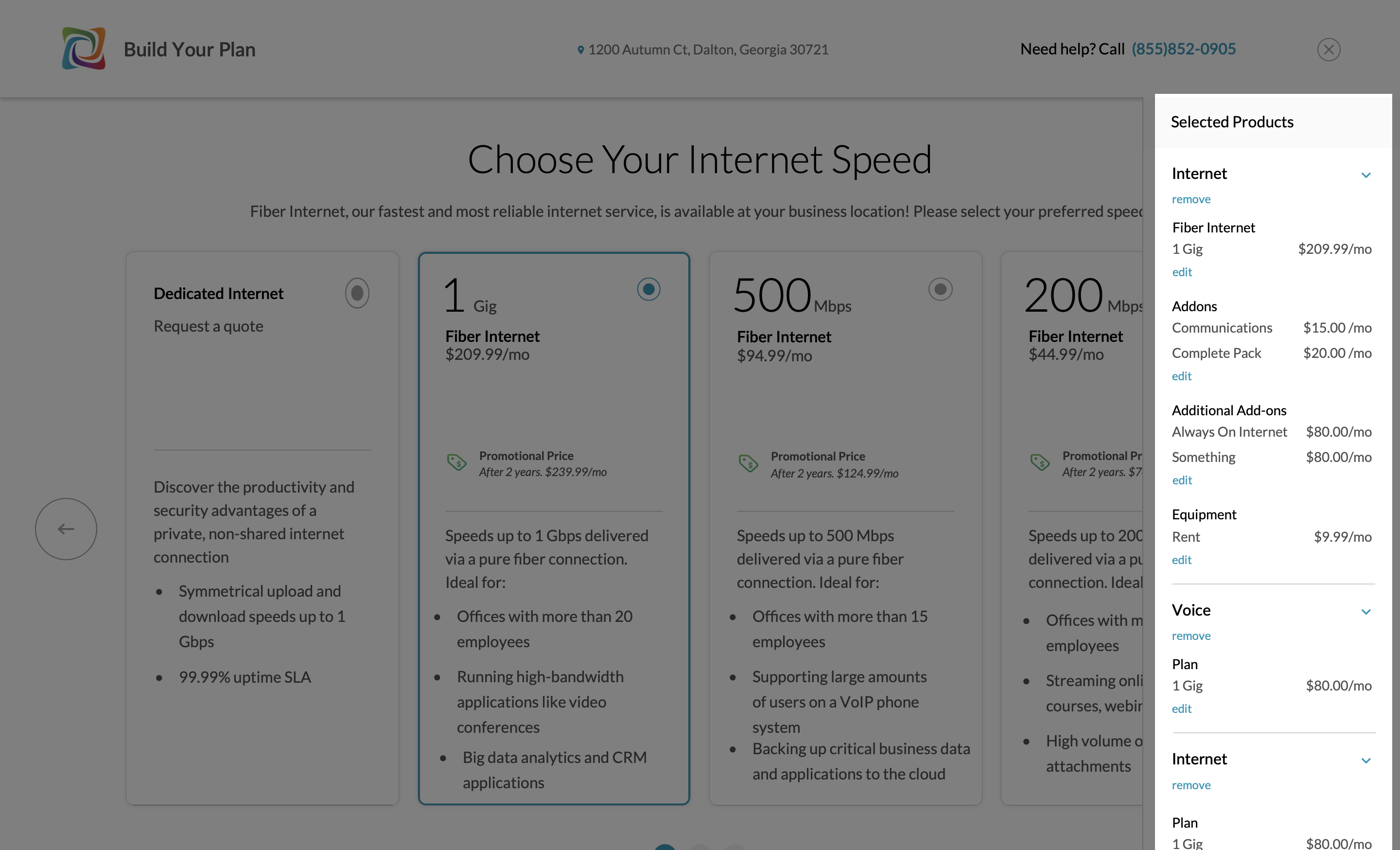
Tested current Product Builder with people, analyzed how they interacted with the application, and asked some questions about their experience as to whether able to complete the task or not.
- The product tile size is too big on a smaller screen and that caused to hide the next step button.
- Big tile forcing me to scroll every time to go next step.
- The style of the radio button is not giving me a feeling of an unselected item.
- There is no previous product to show, but still left arrow button is visible, which drives me to confusion.
- Including this sidebar on a smaller screen makes UI busier.
- I'm not sure whether it's selected or not.
- There is no option for going back?
Current cart user flow
Created a userflow to find how the current flow is going and find possibilities to improve each step a user takes to complete a package.
New cart user flow
Created a refined userflow from it. and it helped to combine multiple flows together and make certain decisions on functionalities.
Design onsiderations
After completing current system usability testing and analyzing the research report, we got a foundation to move in a certain direction. So we set a few design considerations to solve key problems.
Show the main action CTA on screen without scrolling for easy accessibility.
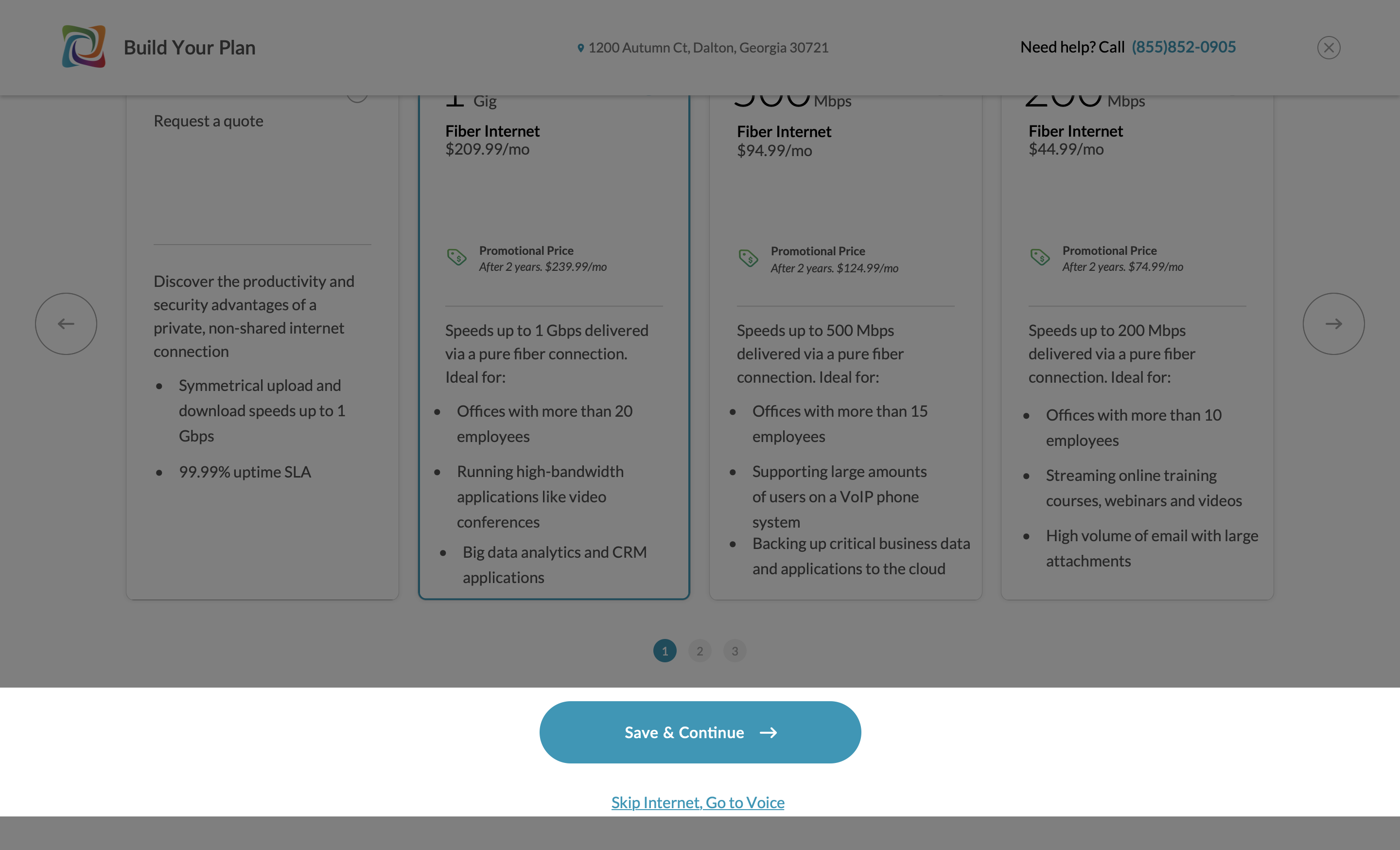
Non-busy and non-confusing UI.
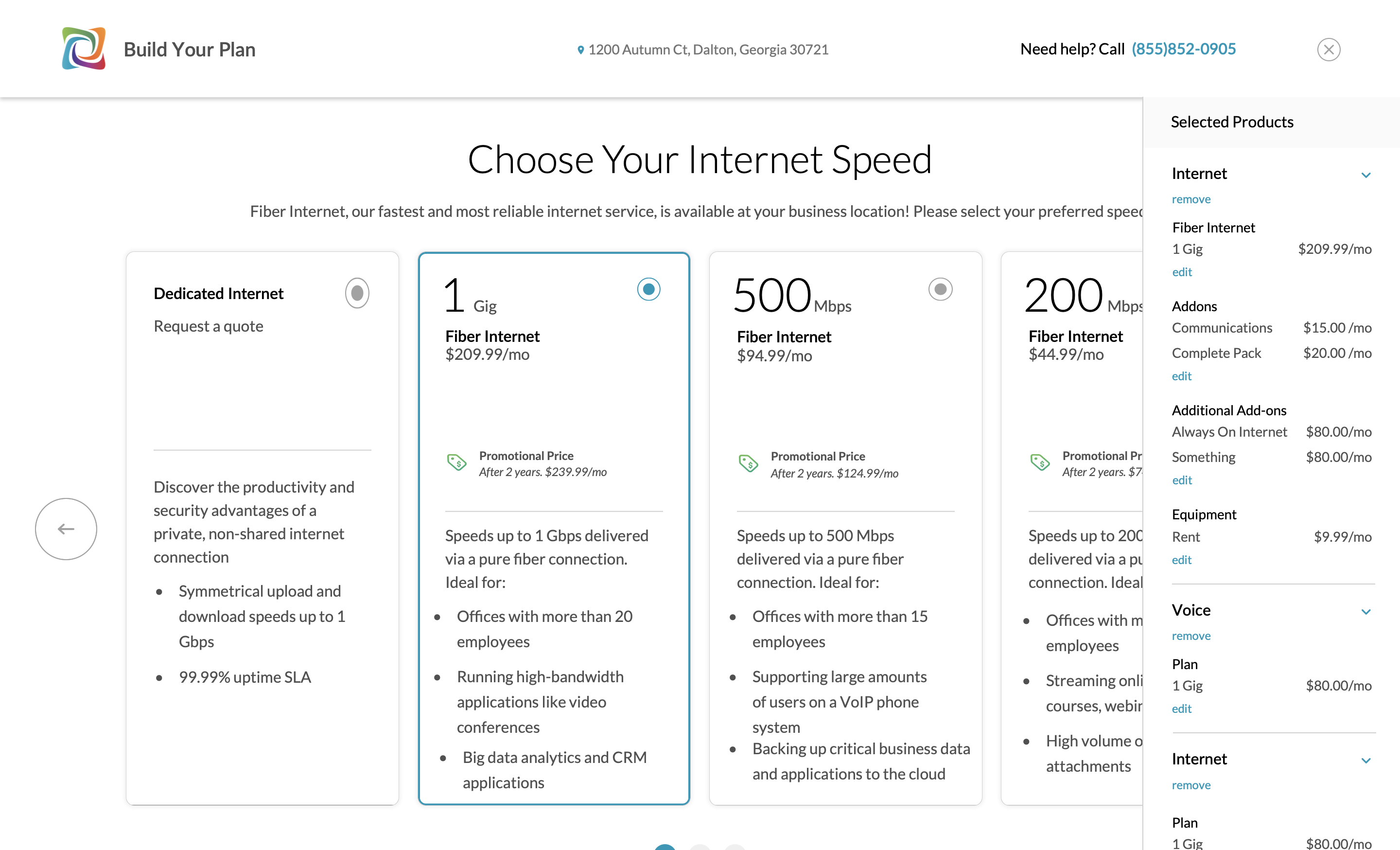
Share the key details of the product with a lesser amount of content at first sight.
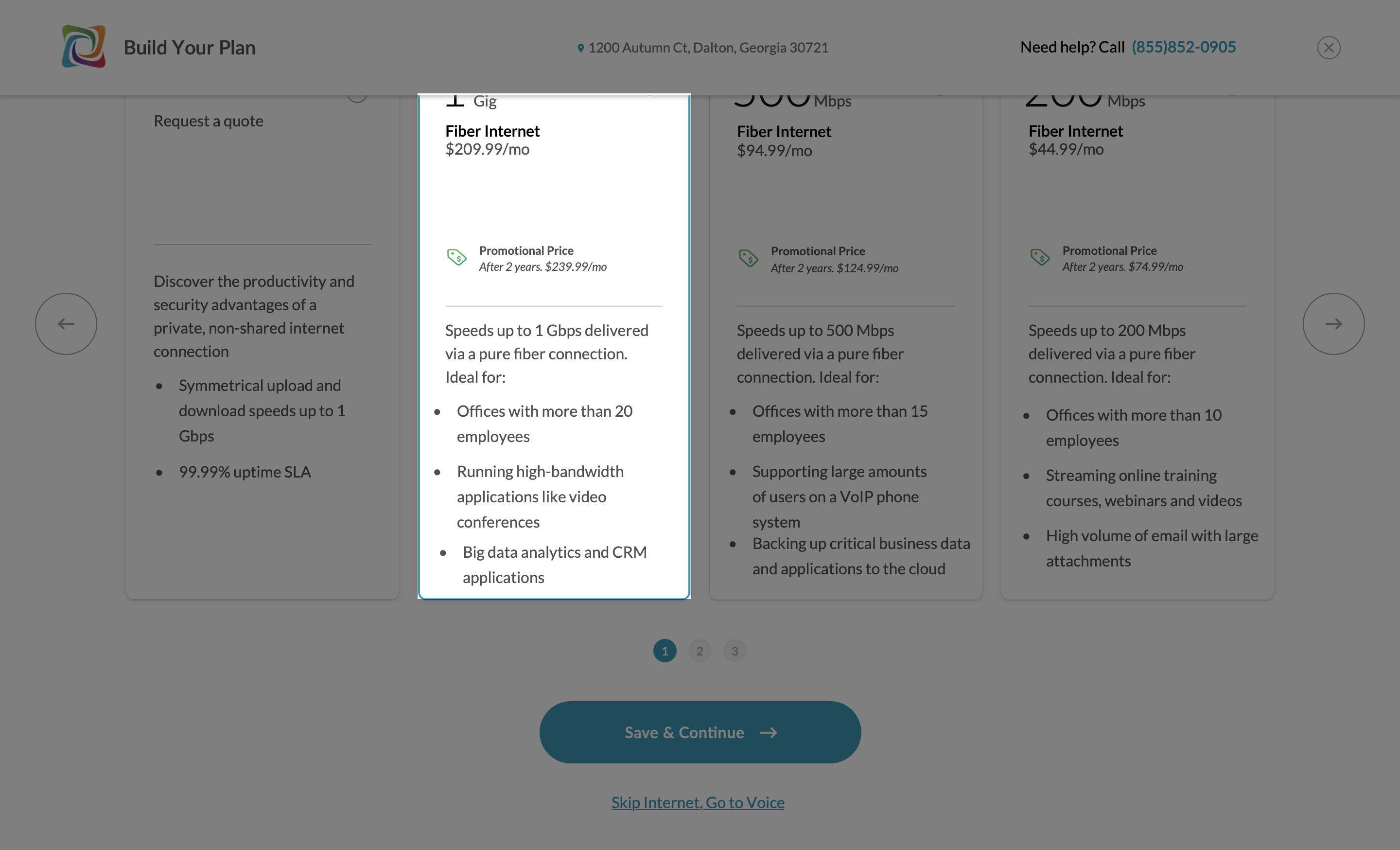
Place "Summary Sidebar" without disturbing UI space.
Brainstorming ideas
Team set a brainstorming session to get more ideas from each member of the team, as long as we know our design considerations. Everyone started to throw the good piece of ideas and we prioritized ideas by vote.
Wireframing
Verifying the designs
With those wireframes, I created a prototype, tested it with Windstream customers, and analyzed and prepared a test report to demonstrate the impact of the new solution.
Final mockups
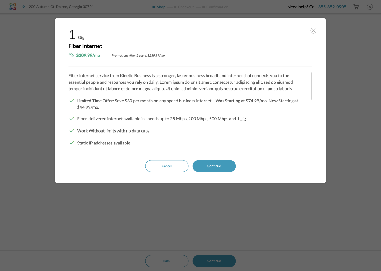
Add a learn more link on the tile and show more details as a popup if a user clicks on "Learn More".
To provide a customer a familiar experience with other E-commerce websites, including the cart summary as a dropdown in the header. It will also help in avoiding a complex user interface.
Styleguide
Designs
Conclusion
After analyzing test and analytical data, the redesigned e-commerce platform for Windstream Telecom resulted in a 26% increase in customer acquisition, a 54% boost in site traffic, and a 33% growth in online orders within a quarter.


