How widget library revolutionized our Sales outreach
Widget library will assist the LiveLike design team in building Proof of Concept (POC) designs faster so the marketing team can demo how LiveLike integration will look on the customer’s platform.
- Atomic Design
- Design Thinking
- User Research
- Usability Testing
- Visual Design & Prototype
My role
My primary responsibility was to lead the design process from initial research through to final implementation. I was involved in various processes, including user research, design strategy, building the library, and usability testing. I worked closely with both the design and sales teams to facilitate the creation of an effective library. This collaborative approach helps demonstrate the potential of LiveLike's integration on diverse client platforms.
Context
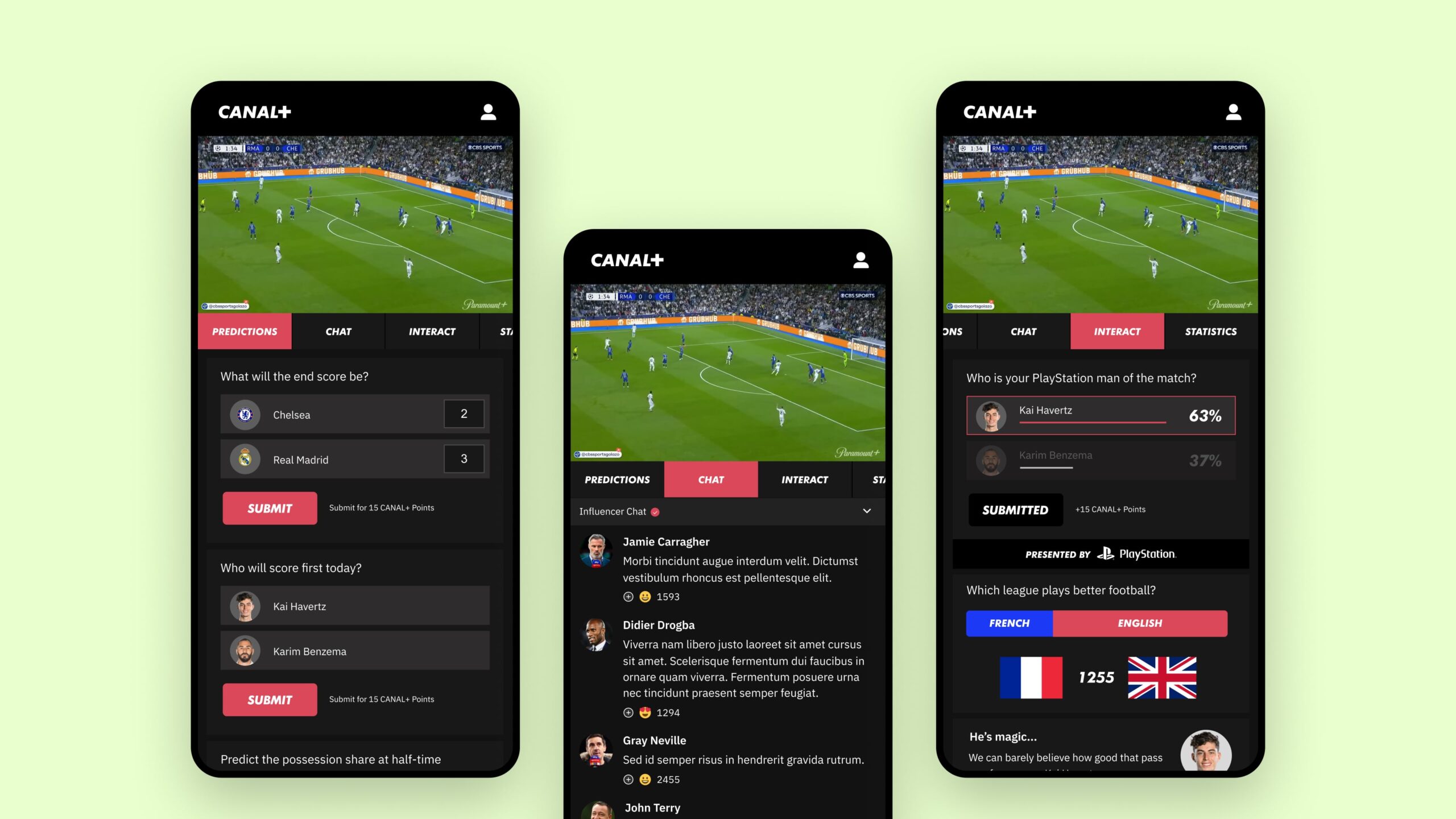
LiveLike sales process involves creating custom proposal mockups and interactive prototypes for each potential LiveLike client. These prototypes showcase how LiveLike would seamlessly integrate with a client's platform, reflecting their unique design style (colors, typography, etc.). this personalized approach offers a strong sales proposition as well. For example, while designing a Proof of Concept (POC) for CANAL+, I developed a cohesive visual experience from scratch. I meticulously aligned the platform's design with the client’s branding and style, ensuring a seamless integration that reflected CANAL+ identity and values.
Problem
It can be quite time-consuming. Building mockups and interactive prototypes for every lead requires significant design effort. This can limit the number of potential clients we can reach and potentially slow the sales cycle.
Goal
The primary objective of creating a comprehensive widget library, is to streamline and accelerate the sales process, empowering the sales team to reach wider customers. This library will enable the design team to:
- Rapidly build customized Proof of Concept (POC) designs
- Reduce the time and effort required to create personalized prototypes
- Showcase LiveLike integration more efficiently on potential clients' platforms
- Increase the number of potential clients the sales team can reach
Target audience
The widget library serves internal designers who create a proof of concept for sales to demo to potential clients across diverse platforms and industries. This focused approach ensures the library meets both internal and external needs, driving sales and client engagement.
Uncover user needs
As per the workshop I conducted with the internal design team, some of the pain points and needs of the design team are listed below.
- “Repeating process of updating the styles of different projects such as color, typography, shadows and more, which leads frustrations”
- “Missing to add all different variants or states of a widget”
- “As a new joiner, I’m not aware of all available widgets and their options and features”
- “It would be great if we have widget micro-interactions on every widget. such as hover, animation while interacting, success states, and so on”
- “Would love to see design changes effected immediately in one place itself”
Insights
- Build a new design style for the stock theme along with this library
- Reusable components and styles
- Show all widgets in the library
- Show options only relevant to a widget
- Include all relevant states to a widget
- Create design tokens to make use of styles effectively and consistency
- Include micro-interaction on widgets
Brainstorming
Uncover all that’s available
To create a comprehensive widget library, I began by cataloging all existing widgets within the product. This inventory allowed me to identify commonalities, unique features, and ensure all components were included.
By breaking down each widget into its constituent components and interaction states, I gained a holistic understanding of the library. This analysis enabled me to identify patterns, redundancies, and opportunities for standardization.
Finding a layout pattern
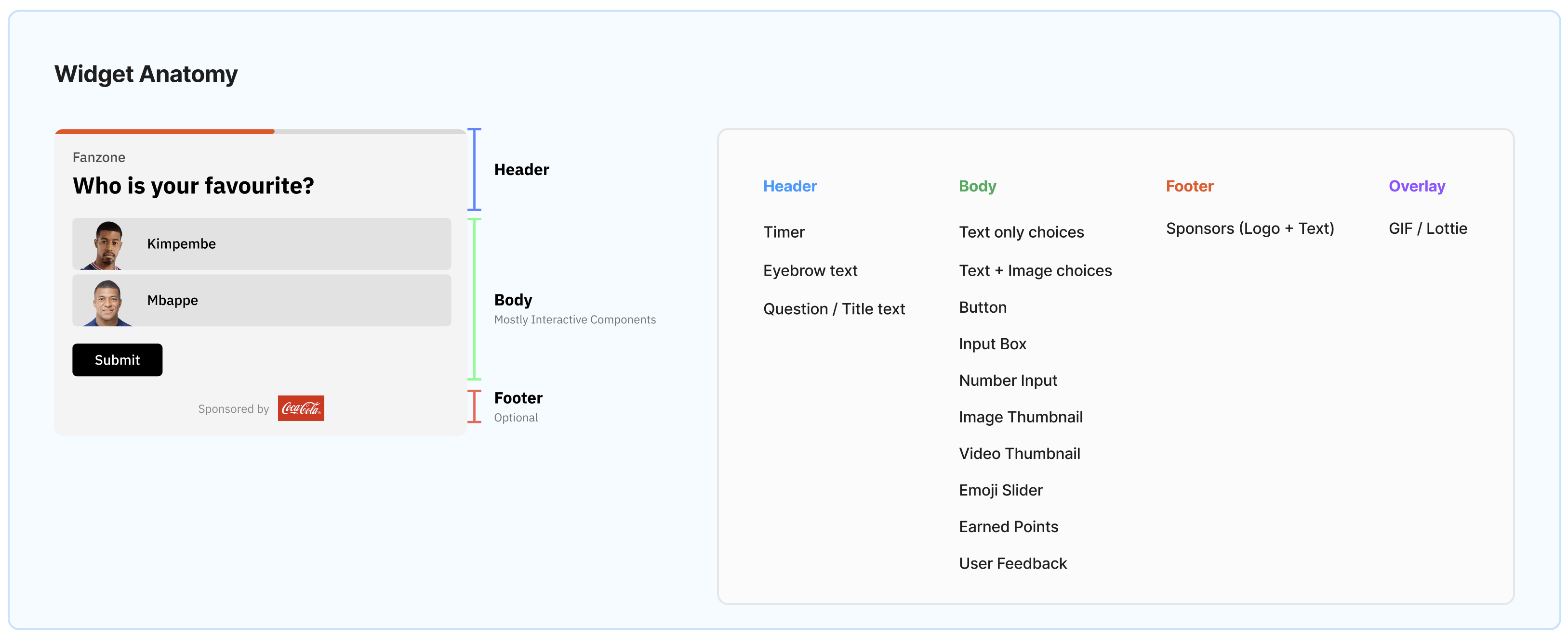
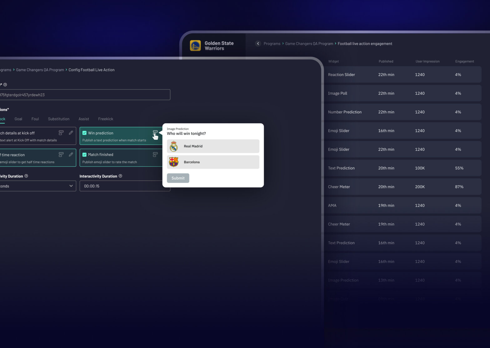
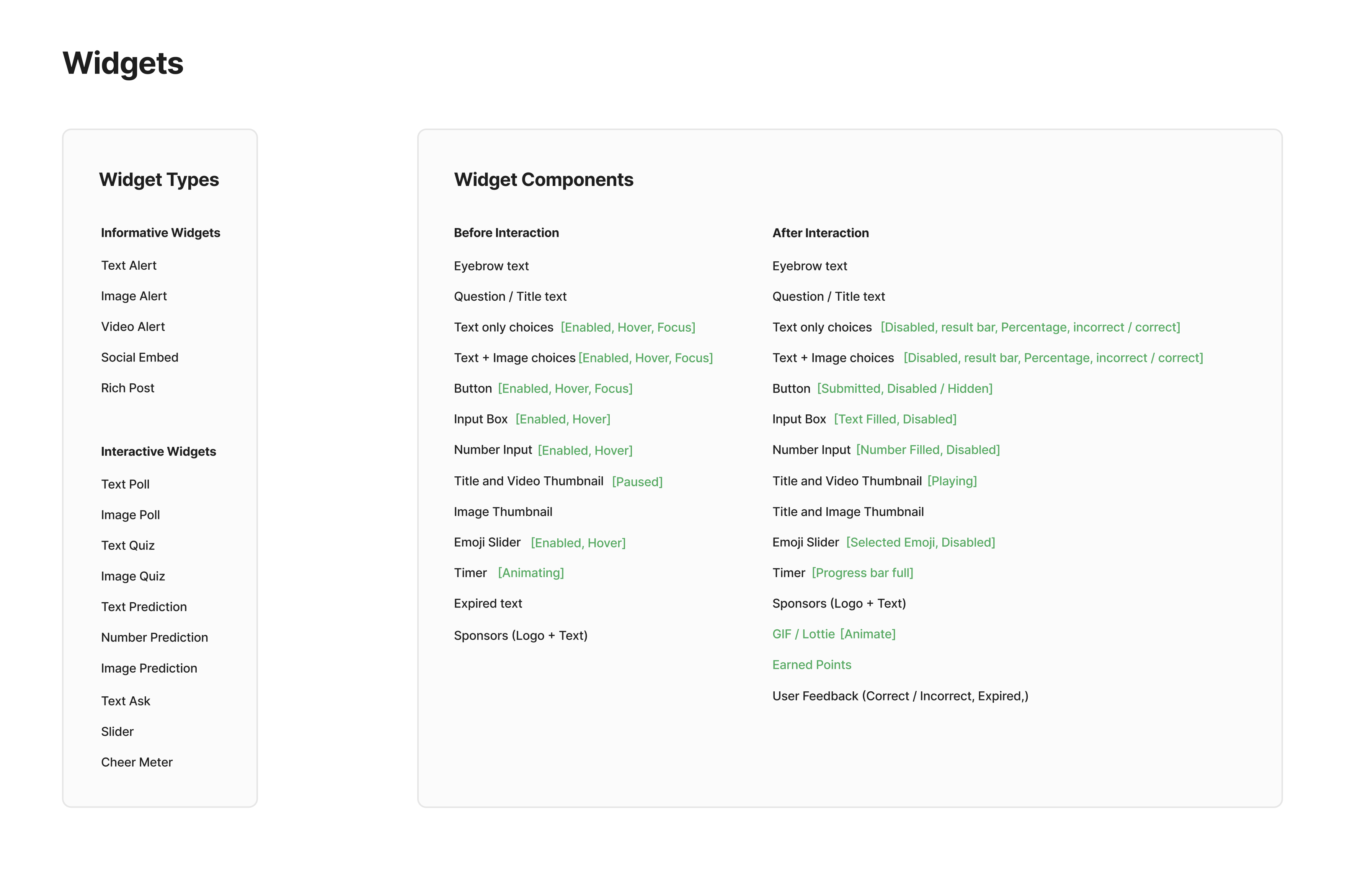
I was researching a usage pattern to simplify the process of using this library easily and found the three-part layout which uses Header, Body, and Footer to complete a layout. and made a catalog of components listed in each part of the layout.
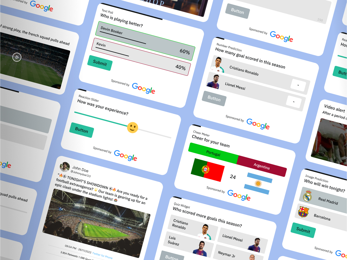
1. Header: Contains key elements such as a timer, question or title, and dismissable actions.
2. Body: Primarily features the interactive components, including elements like poll choices, a reaction slider, a submit button, and other interactive options.
3. Footer: Typically optional, this section may include sponsor details or additional tertiary information.
4. Overlay: Used to display animations after an interaction is completed, such as indicating correct or incorrect after selecting a quiz answer.
Getting everyone on the same page
Since this library’s users are mostly designers, after documenting all these findings, I have walked through this with the team to help them understand the rationality behind this and everyone believed this would make it easy for them to use the library.
Design process
Focus on essentials
Combination of Colors, typography, and spacing makes a design together so I have made reusable styles of LiveLike branding and defined styles in Figma’s variable panel to help quickly update for every project. I have structured variables as below,
Color variables
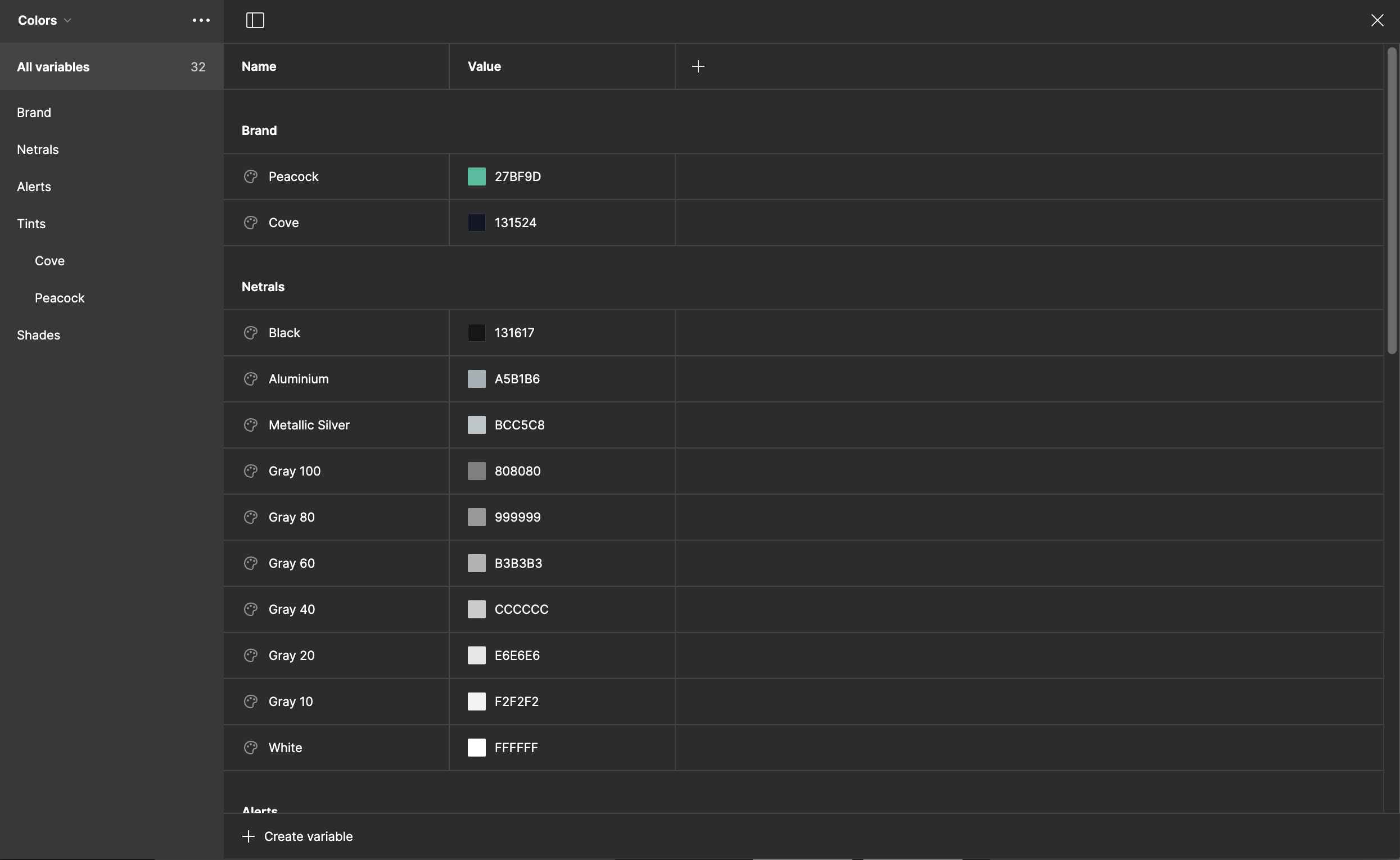
Combination of Colors, typography, and spacing makes a design together so I have made reusable styles of LiveLike branding and defined styles in Figma’s variable panel to help quickly update for every project. I have structured variables as below,
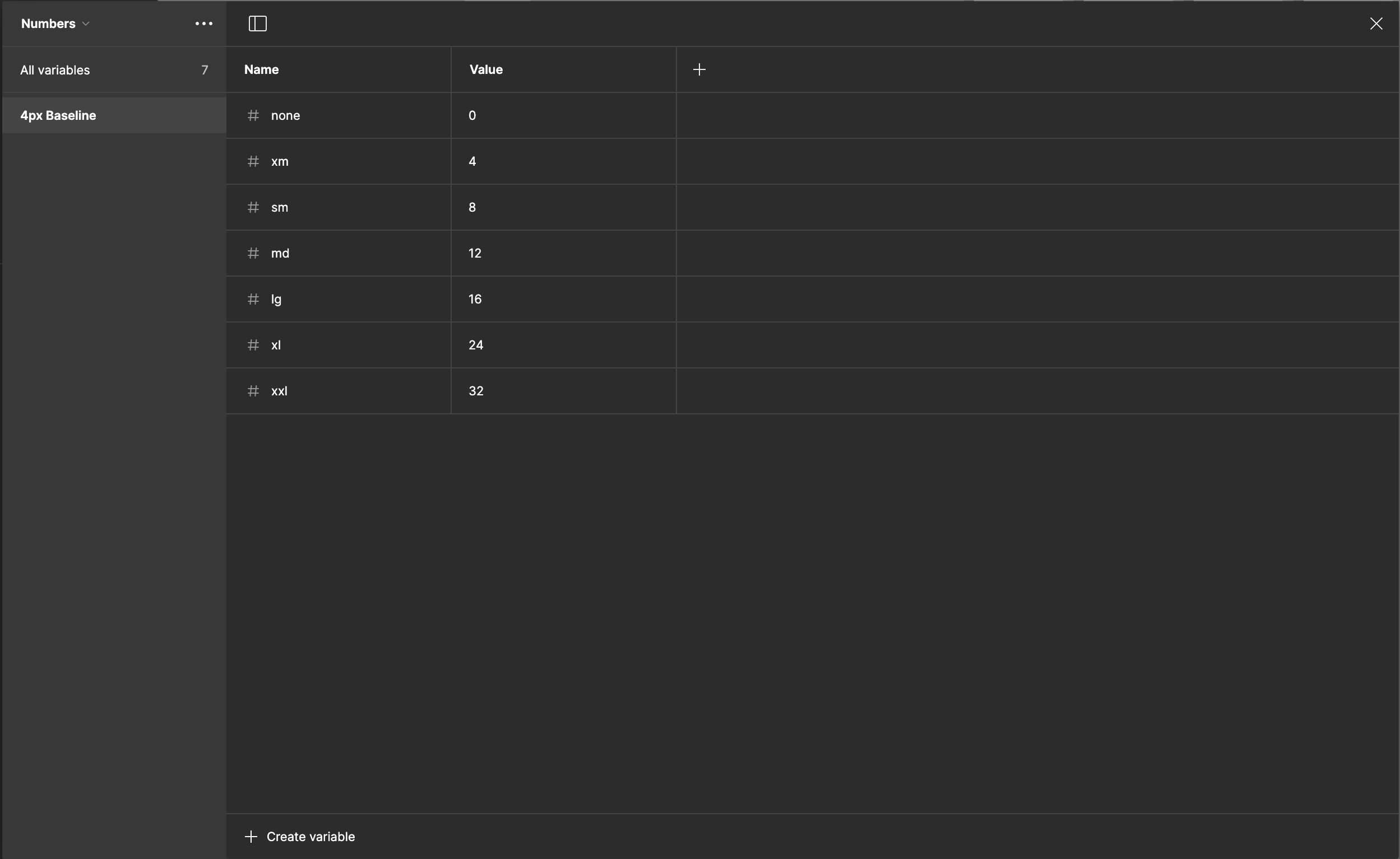
4px baseline variables
Used the 4-pixel baseline for numeric values in the system such as spacing, padding, and border-radius.
Design Tokens
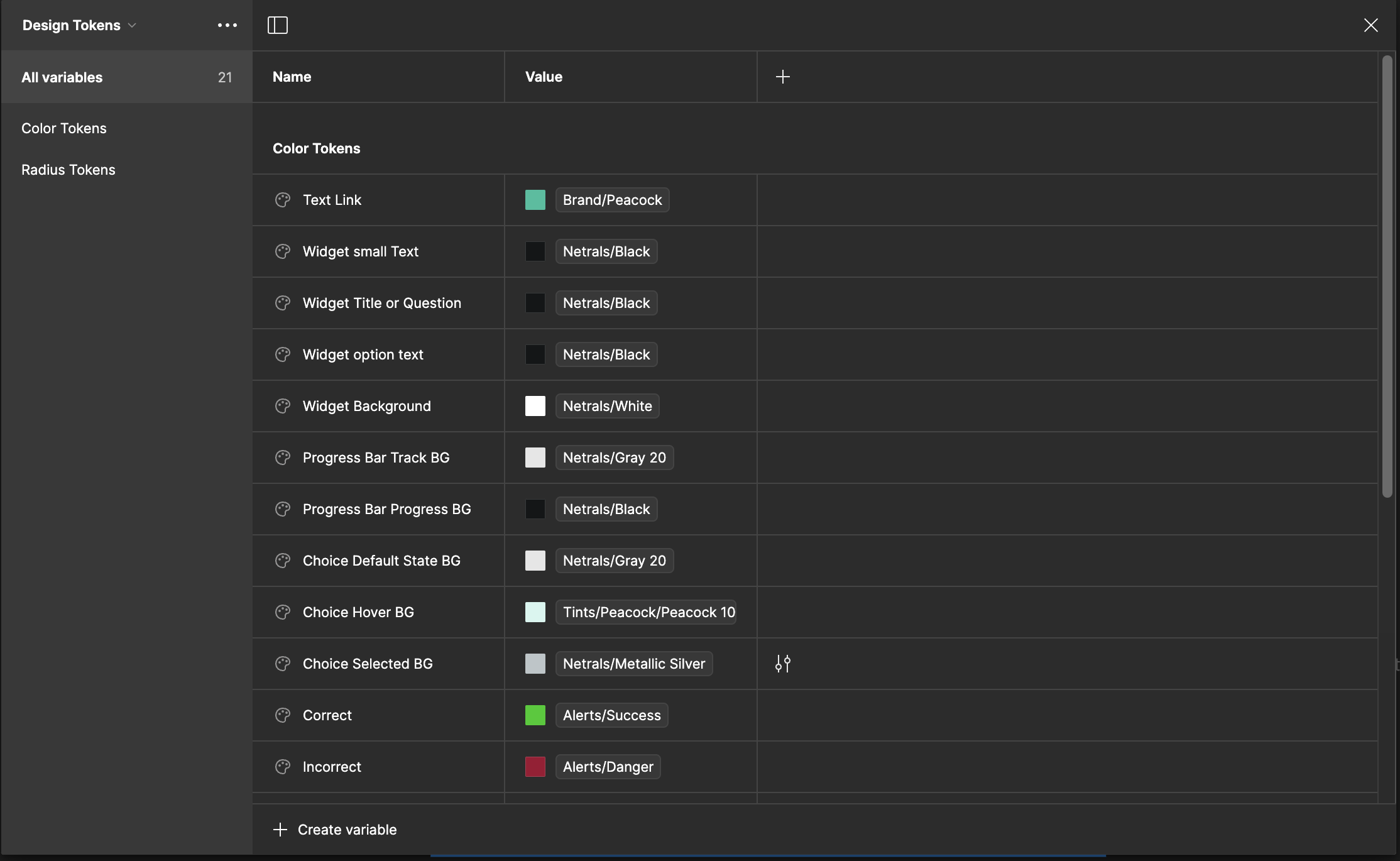
I developed design tokens to streamline design decisions and maintain consistency across the library. These colors and number variables come from the previous variable set. That way it is flexible to change all branding colors in the primary location and update design tokens based on design decisions.
Text styles
Defined normally as text styles for typography. Please note, while I was working on this project Figma didn’t introduce variables in typography.