HDFC Bank mobile app redesign
I was inspired to redesign this mobile app after realizing how difficult it was for many users, including myself, to use it.
- Banking
- Mobile app design
- Product design
- Redesign
- User Research
About HDFC Bank
HDFC Bank is one of India’s leading private banks and was among the first to receive approval from the Reserve Bank of India (RBI) to set up a private sector bank in 1994.
Project Background
I frequently use the HDFC bank app for financial transactions, and I found their user interface and design to be very annoying and frustrating. that gave me an idea to redesign the app's a few experience and user interfaces.
Problem Statement
The current mobile app is not easy to use and confusing UI.
Design Challenge
Improve user experience and visuals of the mobile app.
Current design and experience of the app

Talking to people
I have approached to people from my family, friends and community to know more about their difficulty to using this app and what they are more love to see.
Pain points of users
- UI is not intuitive
- UI looks busy
- Many steps to complete a payment
- Many features are hidden from user’s reach
- Difficult to find transaction history of a individual
- The bottom menu is not prominent
- Various finance transaction options are not visible at a glance
Wireframes
To place elements and decide a screen's content structure, I have created wireframes for a few of the app's main screens.

Ideas to improve
- Modern UI design and experience
- Quick access to the payment options
- Quick access to the bills and recharges
- Consistent UI and experience for payment methods
- Better bottom navbar
- Quick QR scan
- Improve visual hierarchy
- Micro interactions and animations for better interaction feedback
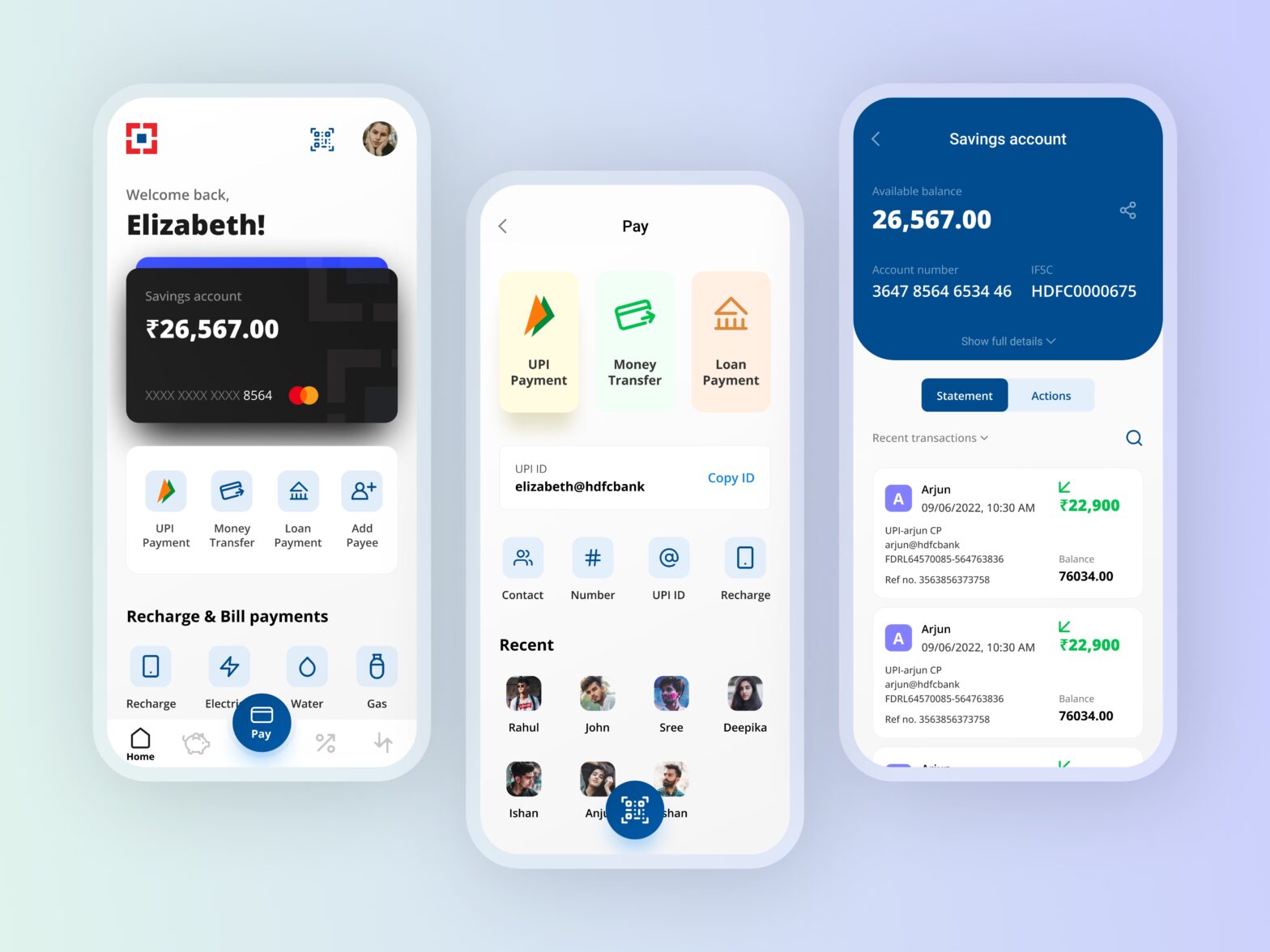
Final designs & Prototype


Prototype
Conclusion
This project taught me that HDFC customers seek substantial enhancements to improve their banking experience.